
Collective Minds
For a school assignment, I created a redesign for Collective Minds.
Collective Minds is a design agency and collective that offers various services to realize projects for their clients. As a collective, they work with freelance designers from different disciplines.
About the project
What makes Collective Minds so unique is that they have a particular niche. They aim to bring more awareness within the society by solely working with small brands that focus on creating a more conscious society.
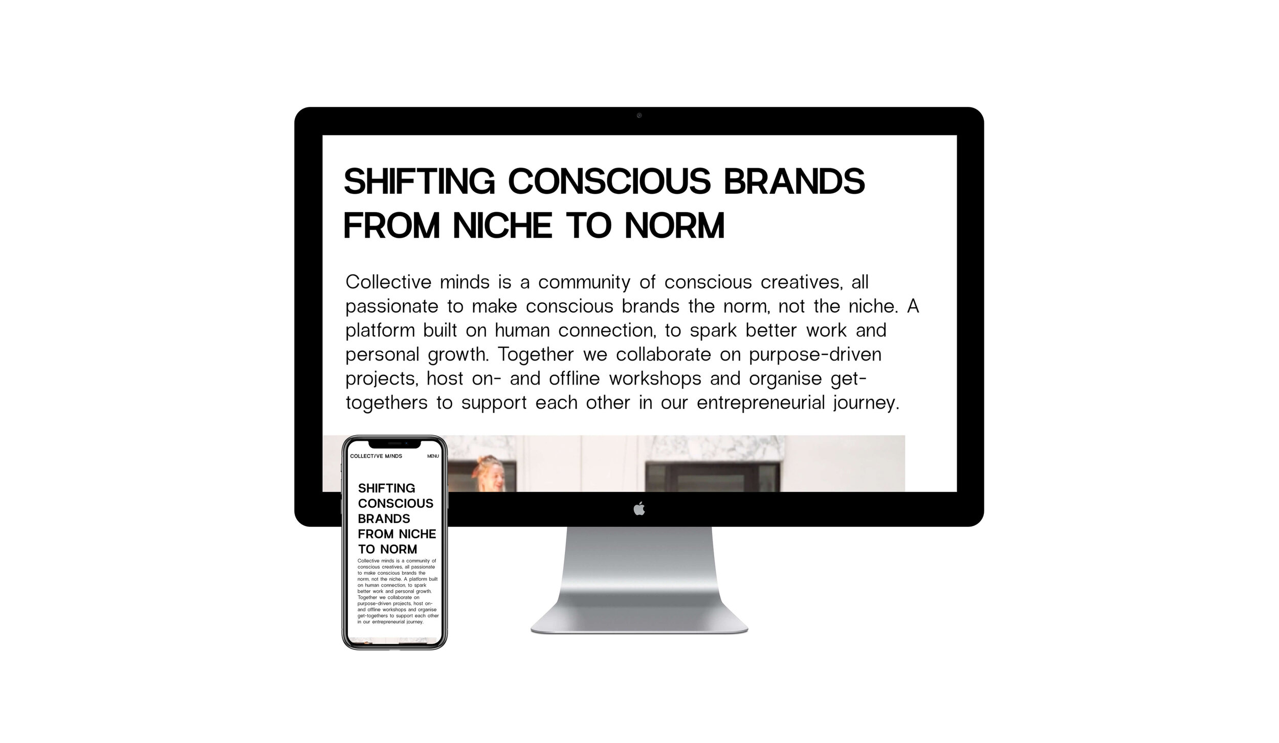
Their primary focus on the assignment was that they wanted to make a shift where Collective Minds becomes an inspirational platform than 'just' being a collective.
Techniques/skills used:
Target group research, company analysis, personas, participant observation, interviewing, conceptualizing, mood boarding, information architecture, lo-fi prototyping, hi-fi prototyping, annotation, and A/B testing.
Programs used:
Adobe XD, Adobe Illustrator, draw.io
First, I started to research the company and the target group. I selected a few participants based on the vision of Collective Minds and interviewed them and asked for feedback on their current website. I only approached people that are also working on a more conscious society in their unique way and analyzed the outcomes. In the interviews, I wanted to know what the target group motivates, how they contribute within the society, and what they think of the current website of Collective Minds. The results of the interviews were alongside a company analysis, and observation used to create personas that represent the target group.
The design fundamentals
You can see the fundaments as the skeleton of the design. In this fase the needed pages and the correlation between the pages got laid out in a simple yet practical way. I first started with making a sitemap.
After making the sitemap. I got a clear understanding of the relationships between the pages of the website, and which type of content suited certain pages the best. With that knowledge I started with making the lo-fi sketch.


Homepage

Project page

Home page bottom part (left sketch) & About page

Subscription page & creatives page — the page that highlights the members.


The personal details
At the collective everyone gets to make their own version of the letter ‘c’ form the word ‘collective’. In that way the creatives can show their personality within the collective in a unique way. I wanted to include this in the website, by adding the le c’s next to the makers to bring the personality of the creative more to light.

A/B testing
One of the most discussed points was a mobile menu on the mobile version. It is a 'storytelling' menu where the categories are displayed in a sentence instead of a summary. I asked what could help people to better recognize the use of the menu, and the mentioned that it should be designed in a way that it would imply that you can tap on it. Option B became the one.

Aesthetics 🤝 user-friendly
The design born form a concept where the creatives have a podium where the can be seen and heard. Two big points that people made during one of the interviews was that creatives want credits for projects when required and that they got a space on the website where they can show who the creatives are, their work, and story.
I also tested the new branding that was created by the collective to make sure that there is a right balance between aesthetics and user-friendly.

