

Vorteq
Offering creative software solutions for your company is what Vorteq does. With their expertise, Vorteq is able to implement tailored software solutions.
About the project
The approach for rebranding Vorteq needed to be a balance between confidence, standing out, clarity and being down to earth. This way of thinking was at the centre of designing every product. The result is a clear visual way that stand out, and communicates openness and clarity. This way they can offer practical creative solutions that their clients in a way that fits Vorteq.
The logo was provided by Vorteq. It didn't completely fit their vision, and they asked if it could be modified. To be able to fit the branding vision better, I made the corners and fillet round, so that it would have a feeling of openness.
For this project I was responsible for the logo and some on the pages of the website (mobile and desktop), pp-sheets for presentation, business cards, and invoice design.
Techniques/skills used:
Target group research, company analysis, mind mapping, hi-fi prototyping, peer testing.
Programs used:
Figma, Powerpoint.
Take a look at their website ↗
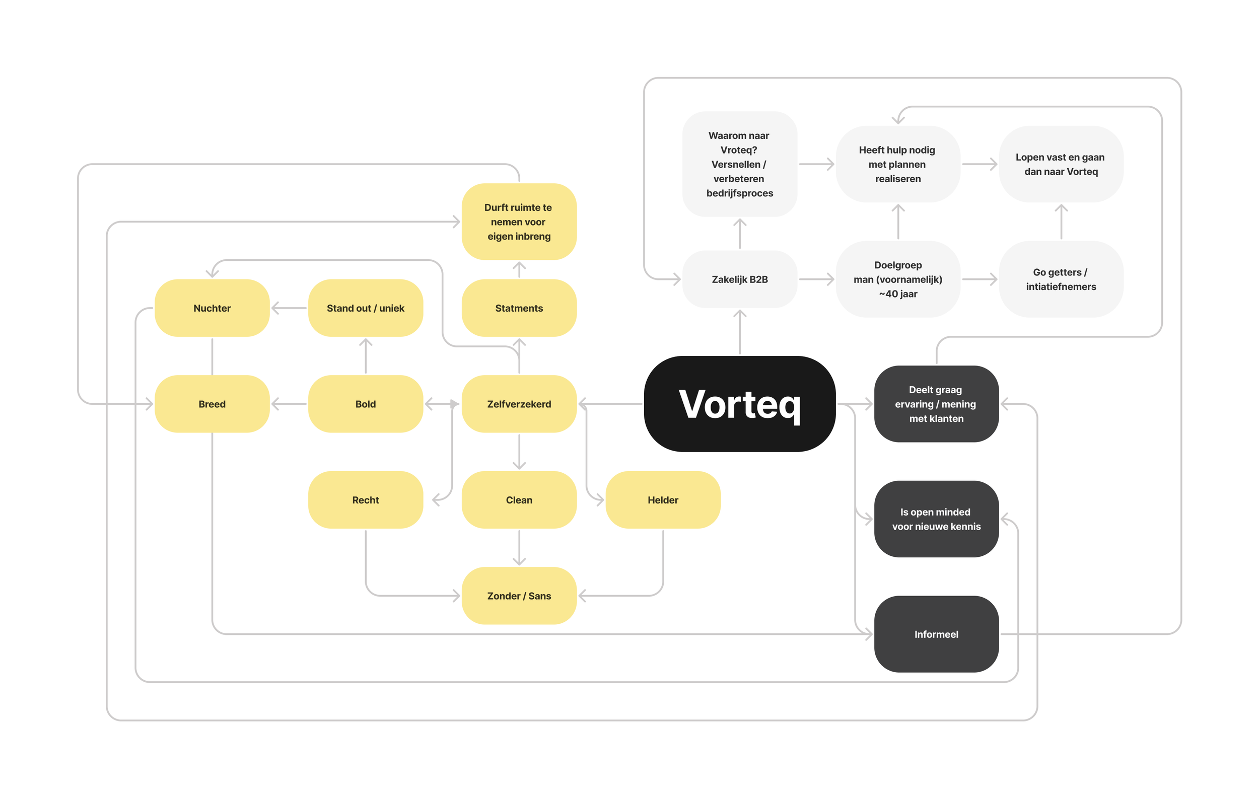
A mind map that I made first to get a image of the company. Based on that the branding was made.

To ensure consistency, I created a brand guide that contains the usage of the logo, overview of colours, fonts, and tone of voice.

Business cards - front side

Business cards - reverse side